


Raven Dark Icon Pack
4.550.00 Reviews
App Specs
- Version
- 1.3.0
- Updated On
- License
- $0.69
- Downloads
- 10,000+
- Developer
- Creativepixels
- Categories
- Personalization
- Platform
- Android
Screenshots
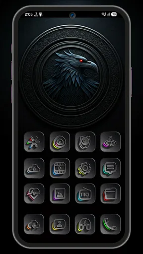
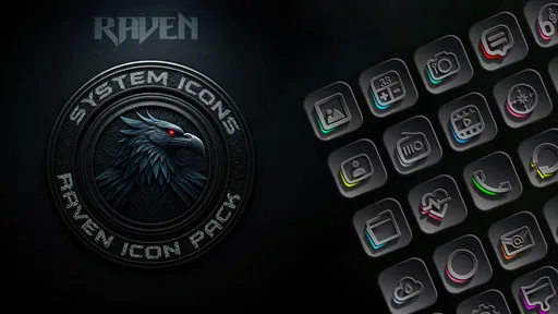
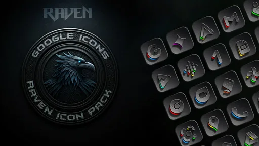
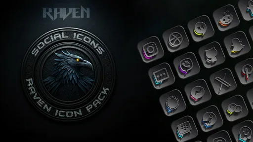
 Analysis by AppCompare
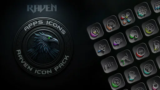
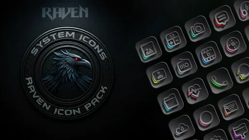
I spent time with Raven Dark Icon Pack as a small but noticeable way to change the mood of an Android phone. It belongs to the personalization category, and its purpose is straightforward: give your home screen a darker, more dramatic visual identity instead of leaving every app with its original icon style. I found that simplicity appealing. This is not an app that tries to reorganize my life or add another complicated layer to the phone; it focuses on appearance and asks whether a consistent dark look makes daily navigation feel better.
The pack is made by Creativepixels and costs $0.69. That places it in the inexpensive paid-app range, which matters here because the decision is less about committing to a large subscription and more about deciding whether a modest visual change is worth paying for. It has a 4.5 average from around 370 ratings, with over 10K installs, so there is already a small but meaningful group of Android users who have chosen this particular style. My own view is that the value depends heavily on your launcher and on how much you care about visual consistency. If your phone already has a carefully chosen dark wallpaper and a launcher that handles icon packs well, the result can feel surprisingly complete. If you rarely look at the home screen or prefer each app's original branding, the appeal drops quickly.
How the dark design fits into everyday phone use
The first thing I noticed was not a single icon but the overall rhythm of the home screen. A dark icon pack works best when it is treated as part of a complete arrangement: wallpaper, widgets, spacing, and icon placement all affect whether the result looks intentional. Raven Dark Icon Pack gives me a reason to simplify the screen rather than filling it with unrelated colors. I would pair it with a restrained wallpaper and fewer shortcuts, because a busy background can compete with the darker artwork and make the icons harder to distinguish.
This is especially useful in the evening. When I check a message, open a map, or start a podcast before bed, a darker home screen feels less visually loud than a collection of bright, mismatched icons. That does not mean the pack changes the brightness of the display or replaces the phone's system theme; its contribution is visual coordination. The distinction is important. Anyone expecting a complete dark-mode solution for every screen will be asking it to do more than an icon pack is designed to do.
In my experience, the most convincing setup is not necessarily the one with the most icons changed. I prefer placing the apps I use most often in a small group and leaving secondary apps in the app drawer. That gives the dark artwork room to breathe and makes the home screen easier to scan. A useful tip is to take a screenshot before changing anything. It gives you a quick reference for restoring the previous arrangement if the new style does not suit your wallpaper or launcher.
There is also a practical trade-off between atmosphere and recognition. Original app icons are familiar because their colors and shapes act as visual shortcuts. A unified dark treatment can make the screen look cleaner, but it may remove some of those instant cues. I adjusted to the change after using the same layout for a while, yet I would not recommend moving every app at once if you rely on color to find something quickly. Start with the main home-screen page, then decide whether the darker treatment improves or slows down your routine.
Why the launcher matters more than the artwork alone
An icon pack is not experienced in isolation. The launcher is the part of the phone that determines how comfortably the artwork becomes part of the interface. Before buying, I would check whether the launcher you already use supports third-party icon packs and whether it offers a way to apply them globally or selectively. That check is more important than choosing between two similar dark styles, because compatibility can decide whether the pack feels integrated or merely decorative.
Worth Reading Before You Choose

EA SPORTS FC Mobile 26 Is a Bigger Football Game, but It Takes Time
Flipboard Shows What News Apps Must Do Beyond the Feed

Switching to Android Auto Means Rethinking Your Driving Routine
Google Calendar Makes a Crowded Week Easier to Manage

Ludo King Makes the Most of the Minutes Between Plans

Baby Panda World Brings Quick Play to Modern Phones, but Its Game Library Feels Busy
For me, the best workflow is to apply the pack, inspect the first two home-screen pages, and then check folders and the app drawer. An icon can look excellent on the main page but feel less coherent inside a folder with untouched icons. Selective editing can solve that problem: keep the most important shortcuts in the new style, while leaving an unfamiliar or poorly matched app in its original form. This is one of the less obvious advantages of treating the pack as a design tool rather than a switch that must be used everywhere.
I also recommend checking labels after applying the pack. Dark artwork can make a screen feel more polished, but text labels still influence how quickly I identify an app. Keeping labels visible is useful during the adjustment period, particularly if several icons have similar silhouettes. Once the layout becomes familiar, reducing visual clutter can make the home screen calmer, but removing labels immediately may create unnecessary friction.
The app is suitable for Everyone, and it runs on Android 5.0 or later. That broad system requirement makes it approachable for people using older Android phones as well as newer devices. Still, the experience will not be identical across phones because launchers and manufacturer interfaces handle customization differently. I would consider the operating-system requirement reassuring, but I would treat launcher behavior as the real compatibility question.
Connectivity during setup and normal use
Connectivity shapes the experience most clearly around discovery and setup. When I am choosing a personalization app, I usually want to see its visual style before committing, and an internet connection is the natural context for browsing the store page, installing the package, and checking any available app information. That part of the process is ordinary, but it means the smoothness of the first experience depends on more than the icon design itself. A slow connection can make a simple customization task feel needlessly drawn out.
Once the pack is installed and applied, my attention shifts away from connectivity and toward the launcher. The everyday question is no longer whether the store page loads; it is whether the chosen icons remain available and whether the home screen behaves normally when I move between mobile data, Wi-Fi, and places with weak reception. I would not buy this app expecting it to improve network access or change how other apps connect. Its role is visual, so the useful test is whether the customized layout remains practical when I am opening apps in ordinary mobile situations.
That distinction helps set realistic expectations. Raven Dark Icon Pack is not a communications tool, a cloud dashboard, or a service whose main value disappears when the signal changes. Its connectivity-sensitive moments are concentrated around getting it, setting it up, and revisiting the app when I want to adjust the appearance. The home-screen design itself should be judged separately from the quality of the network available at a given moment.
I would still avoid making changes while rushing through a poor connection. If the installation or setup screen takes longer than expected, it is easy to tap repeatedly or assume that an action failed. My better approach is to wait for the current step to finish, then inspect the launcher before trying again. That simple habit reduces the chance of creating duplicate shortcuts or changing the layout twice because the first action was merely delayed.
Using it on the move, at work, and at home
The strongest everyday scenario for this pack is a phone that travels between very different contexts but keeps the same visual identity. Imagine checking the phone during a commute, opening a work shortcut during a break, and then using the same device at home in a dim room. The dark styling gives those transitions a consistent feel. It does not make the phone more productive by itself, but it can make a frequently used home screen feel less accidental and more personal.
At work, I would keep the design restrained. A dark icon arrangement can look professional when the wallpaper is simple and the number of visible shortcuts is limited. If the screen contains many colorful widgets, social apps, and notification badges, the icon pack may not be enough to create a calm appearance. In that situation, the better improvement may be reducing clutter rather than changing every icon.
On the move, recognition speed becomes more important. If I am walking, carrying a bag, or checking the phone quickly, I do not want to hunt for an app because several icons now share a similar dark visual language. I solved that by keeping the most frequently used apps in fixed positions and using folders for less urgent tools. The pack then supports muscle memory instead of fighting it. This is a practical adjustment that is easy to overlook when focusing only on screenshots.
At home, the visual benefit is easier to appreciate. A dark arrangement works naturally with evening routines, especially when I want the phone to feel less bright and distracting. Again, this is an aesthetic effect rather than a promise of reduced screen light. The actual comfort of nighttime use still depends on the phone's brightness, display settings, and the apps being opened.
What happens when the setup does not go smoothly
The main point of friction is the gap between installing an icon pack and getting a satisfying result. A pack can be attractive in isolation yet look uneven when combined with a particular launcher, wallpaper, or collection of apps. I would not interpret an imperfect first screen as proof that the artwork is poor. Instead, I would test a smaller arrangement, change the wallpaper, and inspect whether the remaining mismatch comes from the launcher or from individual app icons.
A sensible recovery workflow is to record the original home-screen arrangement, apply the pack to one page, and keep the change limited until the result feels right. If the appearance is not convincing, restoring the previous layout is easier when the original positions are known. This is also why I would avoid redesigning the wallpaper, widgets, folders, and icon layout simultaneously. Changing one layer at a time makes it clear what helped and what created the problem.
Another realistic issue is visual ambiguity. Some apps are instantly recognizable by their original colors, while a dark pack can make several shortcuts appear more alike. My workaround is to reserve the dock for the apps I use constantly and place less familiar tools inside labeled folders. That keeps the dramatic look without sacrificing quick access. Users who depend on highly distinctive original icons may find this compromise annoying, and they may be happier with a lighter or more varied icon style.
If the pack does not appear where expected, I would first inspect the launcher's icon settings rather than repeatedly reinstalling the app. Third-party customization often depends on a launcher option, and changing the installation state will not necessarily solve a setting that is disabled or unsupported. This is a useful distinction for troubleshooting: determine whether the issue is the pack, the launcher, or the arrangement before taking more drastic action.
The current version is 1.3.0, and I would keep the app updated in the normal way when an update is offered. For a personalization tool, updates can matter because the visual experience depends on how well it fits the changing collection of apps and the Android environment. I would not treat the version number as a reason to expect a specific feature; I simply see it as a reminder to review the setup after updating and make sure the home screen still looks consistent.
Keeping the customization sensible with limited data
For data-conscious users, the important habit is to separate installation from experimentation. I would install the pack when connected to a reliable network, then spend time arranging the home screen deliberately instead of repeatedly changing settings while mobile data is active. The customization itself is a small visual project, so there is little benefit in rushing through multiple attempts during a commute or in an area with an unstable signal.
I also prefer making a plan before opening the settings. Decide which page should change, which apps belong in the dock, and whether labels should remain visible. That reduces unnecessary back-and-forth and makes the process more predictable. It is a modest tip, but it matters because personalization apps can encourage constant tweaking; a clear target keeps the experience focused rather than turning it into a cycle of random adjustments.
People who share a phone or move between several launchers should be especially deliberate. A carefully arranged dark screen may look excellent in one launcher and less convincing in another. If you switch launchers often, I would treat the pack as one part of a design experiment rather than assuming every environment will present it identically. The inexpensive price makes experimentation relatively low-risk, but time and attention are still costs worth considering.
There is also a question of whether the visual change justifies another installed app. If you use a minimalist launcher with only text labels, or if your phone is already heavily customized through a manufacturer theme, this pack may add little. In that case, the usual alternative—a built-in theme or the launcher's own icon options—could be more convenient because everything is managed in one place. Raven Dark Icon Pack makes more sense when you specifically want its dark identity and your current launcher can use it comfortably.
Who will enjoy it and who should choose another approach
I would recommend this app to someone who notices visual inconsistency every time they unlock the phone. It is a good fit for users who like dark aesthetics, want a more deliberate home-screen arrangement, and are willing to spend a few minutes adjusting folders, labels, and wallpaper around the icons. It also suits people who prefer a one-time personalization purchase over a more elaborate customization system.
I would be more cautious for anyone who wants a complete phone-wide transformation. An icon pack is only one layer of the interface, so it will not automatically redesign settings screens, notification panels, widgets, or the internal appearance of individual apps. A full system theme is the better route when the goal is uniformity beyond the home screen. Likewise, users who need instant recognition from original brand colors may prefer to keep their standard icons or change only a few shortcuts.
The app's Everyone age rating and Android 5.0 minimum make it accessible across a broad range of compatible devices. Even so, accessibility is not the same as universal suitability. A person with reduced vision may find a dark, unified design less readable depending on contrast, wallpaper, and launcher labels. I would test the home screen in the lighting conditions where the phone is normally used rather than judging it only from a bright store preview.
For me, the best result comes from moderation: apply the style to the main page, keep important labels while learning the new layout, and use fixed positions for essential apps. That approach preserves the personality of the pack without allowing the design to slow down basic tasks. It also gives a clear exit if the change does not work; restoring a single page is much easier than rebuilding an entire phone arrangement.
My connectivity verdict on the overall experience
Raven Dark Icon Pack is a focused personalization purchase whose network-related importance is mostly concentrated around installation, browsing, and setup. The app's value is visible after those moments, in how the home screen looks and how easily I can find the apps I use every day. I would not choose it for connectivity features, and I would not expect it to alter the behavior of other apps when the signal changes. I judge it as a visual tool that should remain useful during ordinary mobile use once the launcher is arranged.
The dark style is most successful when I treat it as part of a workflow rather than a one-tap makeover. Check launcher compatibility, begin with one page, preserve familiar positions, and judge the result in both bright and dim surroundings. Those steps address the real trade-off: a cleaner, moodier screen can be more pleasant, but it may also reduce the color cues that make original icons instantly recognizable.
At $0.69, I see it as a reasonable choice for someone who already knows they want a dark icon aesthetic and has a launcher ready for customization. The 4.5 average and over 10K installs suggest that the concept has found an audience, while the modest scale of the app makes its focused purpose clear. I would recommend it to a friend who cares about the look of the home screen and is happy to make a few layout decisions. I would skip it in favor of a built-in theme or a broader launcher package if the goal is a complete system redesign, not simply a darker and more coherent set of icons.
Pros
- Dark
- elegant icons give home screens a consistent modern look.
- Includes alternative icons for customizing popular apps.
- Works with many popular Android launchers.
- Lightweight download with minimal impact on device storage.
- Regular updates can expand support for newly released apps.
Cons
- Requires a compatible launcher; it cannot replace standard system icons alone.
- Some less popular apps may still use generic or mismatched icons.
- Full customization may require manually changing several icons.
- Icon style may feel too dark or subtle for bright
- colorful wallpapers.
- Availability and features can vary depending on the launcher used.
FAQs for Raven Dark Icon Pack
What is Raven Dark Icon Pack?
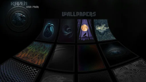
Raven Dark Icon Pack is a customization app for Android devices that replaces standard app icons with a dark, stylish visual theme. It is designed for users who want a more consistent home-screen appearance, especially when using dark wallpapers or a dark system theme. The pack generally includes themed icons for popular apps, along with wallpapers and launcher support features.
Which launchers are compatible with Raven Dark Icon Pack?
Compatibility depends on the launcher installed on your Android phone or tablet. Raven Dark Icon Pack is typically intended for popular third-party launchers that support icon packs, such as Nova Launcher, Lawnchair, Smart Launcher, Action Launcher, Apex, and similar options. Some stock launchers may not support external icon packs directly, so checking your launcher’s settings or the app’s compatibility list before downloading is recommended.
Does Raven Dark Icon Pack include icons for every application?
The pack may cover many widely used applications, but it is unlikely to include a custom icon for every app available on Google Play. Unsupported icons may remain unchanged or appear with an alternative design, depending on the launcher. Many icon-pack launchers also provide an icon request feature, allowing users to ask the developer to add missing icons in future updates.
Is Raven Dark Icon Pack free to use?
The availability and pricing can vary depending on the version listed in the app store. Some versions may be free, while others can require a one-time purchase or include promotional pricing. Before installing, review the current store listing for information about cost, advertisements, in-app purchases, update support, and refund policies. The exact features may also differ between releases.
How do I apply Raven Dark Icon Pack to my home screen?
After installing Raven Dark Icon Pack, open the application and look for an option such as Apply, Apply Theme, or Apply Icon Pack. Choose a compatible launcher from the list and confirm the change. If automatic application is unavailable, open your launcher’s theme or icon settings and select Raven Dark manually. Some launchers may require individual icons to be changed one at a time.


